Viewing Data Profiling results
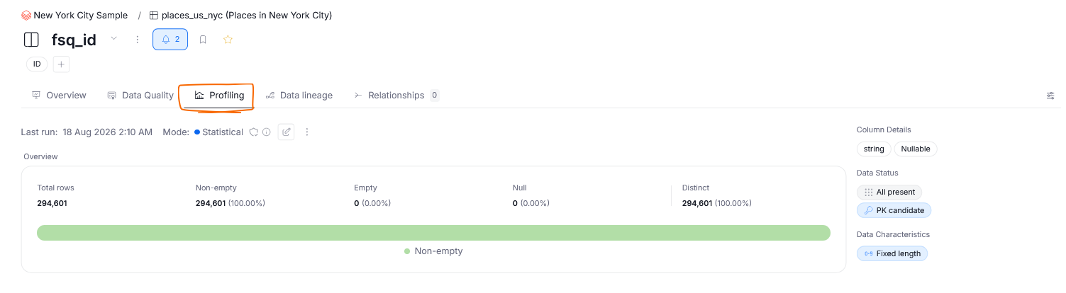
You can view the results of an asset's Data Profiling in its Profiling tab.
Data Source profiling dashboard
Each Data Source has a profiling dashboard, that you can view in its Profiling tab. This dashboard can be viewed by any users with Viewer permissions, and becomes visible when at least one profiled column has been published.
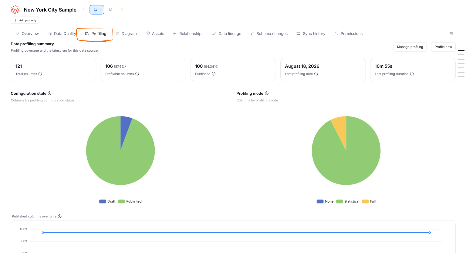
This dashboard contains important statistical data regarding Data Profiling in your Data Source. You can view details like the number of published columns, profiling duration, changes in profiling over time, different profiling modes configured for your columns, and many more.
Profiling Visibility
Profiling results can be in two distinct states — Published and Unpublished.
Unpublished profiling results are visible only to (Power) Data Stewards. The moment a profiling result becomes published, it is treated as part of the catalog and can be viewed by all other users with relevant permissions — as of version 26.3 this is all user types except for viewers.
Learn more about publishing profiling results here.
Profiling Badges
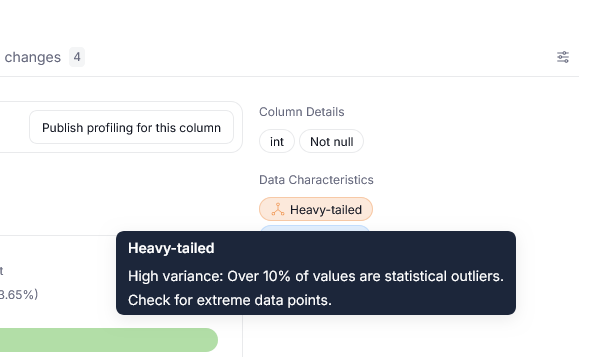
Profiling Badges provide some of the most important characteristics of your data at a glance. They are assigned automatically after every profiling run and refer to things like Data Status, Characteristics, or Details.
In the Profiling tab, you can view them on the right-hand side.
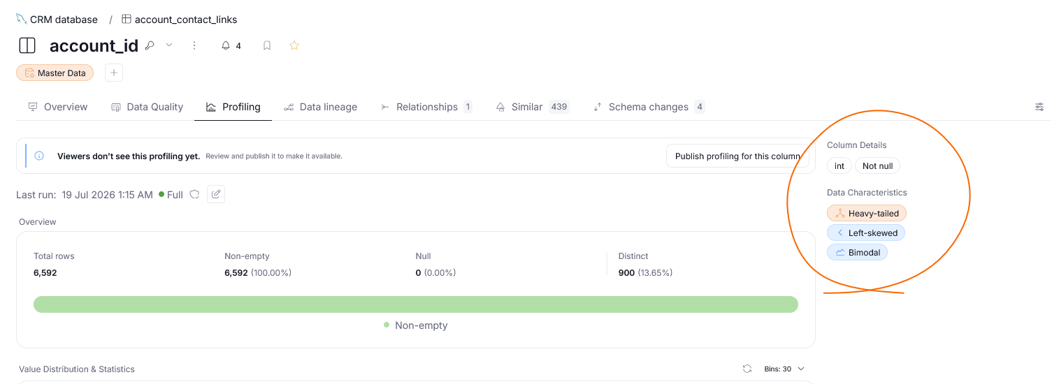
Hovering over a badge shows a descriptive explanation.
Widgets
Profiling results are shown as a series of graphs and widgets representing different statistics of your data. The exact elements displayed differ based on the characteristics of your data and profiling mode. Profiling findings include, but are not limited to:
- an overview of most common values with their statistical breakdown
- text formatting patterns in your data
- data completeness
- value distribution of integer-like data
As a rule of thumb, if only statistical data is enabled, sample values will not be shown, and neither will widgets that rely on those samples (like an overview of most common values).
Interactions
Despite the large variety of profiling widgets, there are some common modes of interacting with them:
Display modes
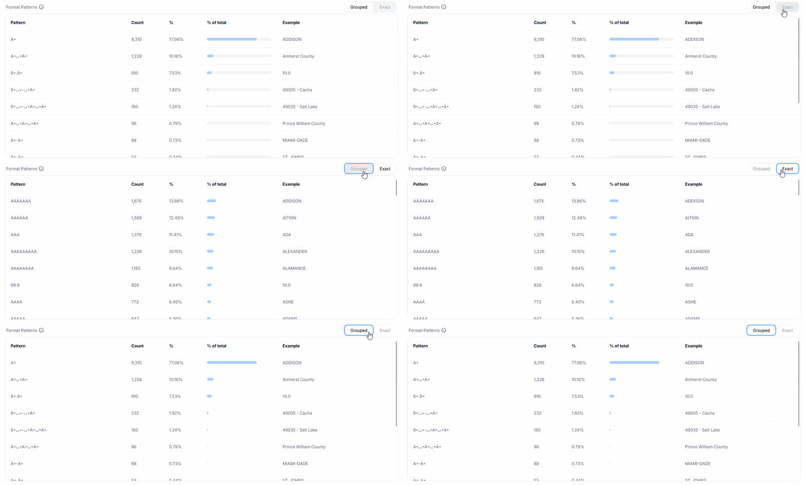
Certain widgets let you modify how the data is grouped and displayed. You can change this using a toggle on the top-right side of the widget. Examples of this interaction are switching between a table and a chart view for the Value Composition widget or displaying common data patterns either by grouping them based on likeness or treating each one as a singular instance.
Widget display modes
Bucketing
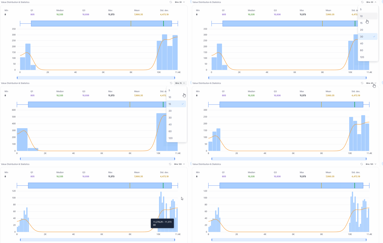
Some widgets rely on data distribution. You can modify the intervals used to group data using the Bins parameter. The default is 30.
Top values
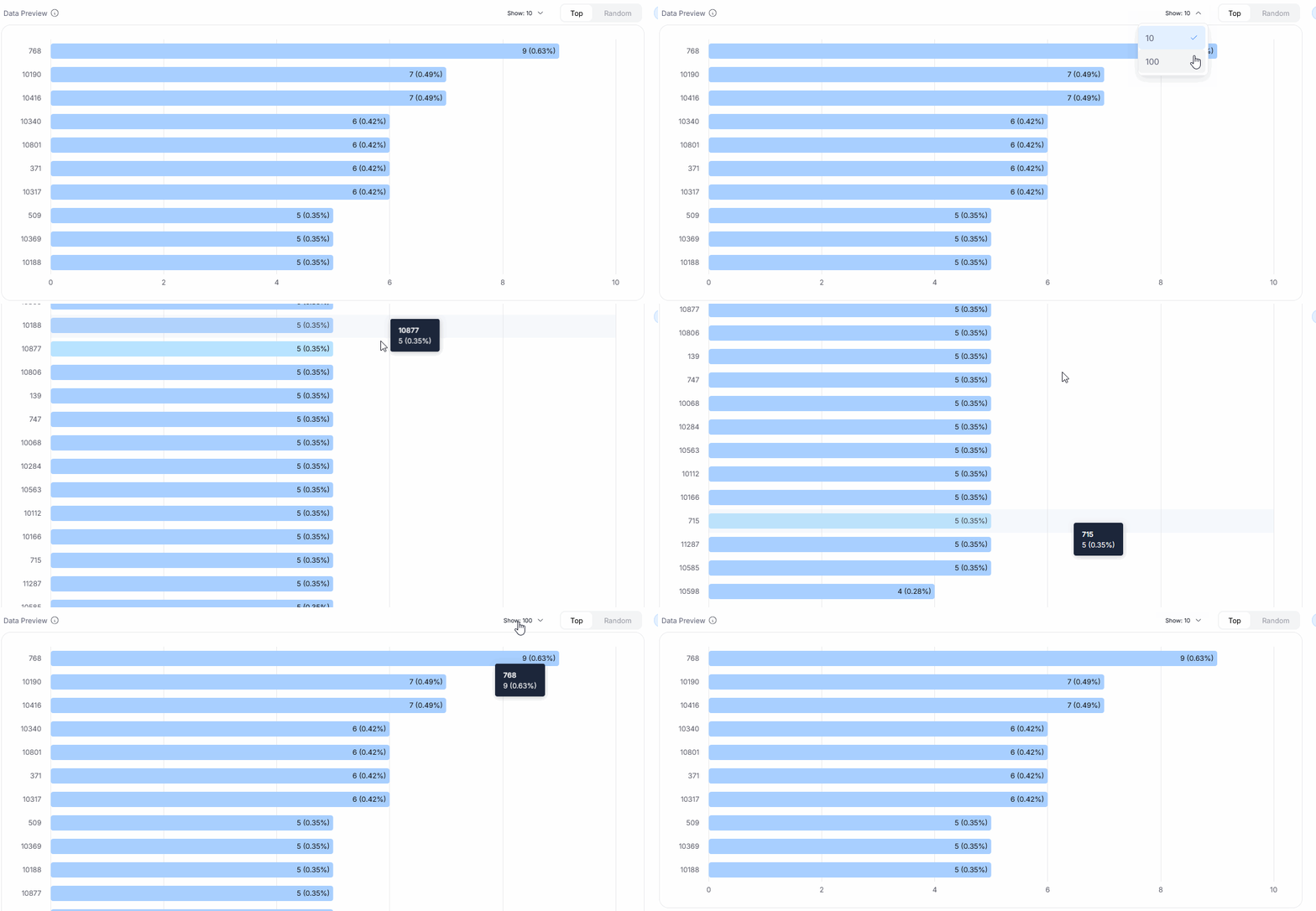
Widgets that preview sample data will usually show only a certain number of top values. By default, this is set to 10; however, you can modify the sample size using the Show parameter.
History
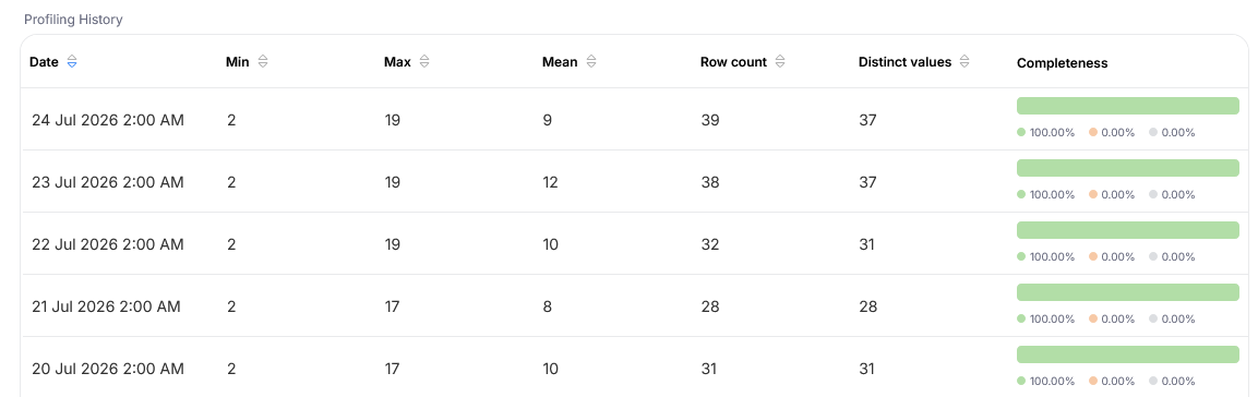
When you scroll down to the bottom of the Profiling tab, you will see the Profiling History section. This is a grid where each row corresponds to a date on which a profiling run took place. You can also view a set of stats — like a minimal and maximal value, mean (in case of non-numerical data: most common) value, row count or number of distinct values.